More than isolated slides, this project focused on building value and a cohesive visual narrative system capable of supporting pitches, institutional and product presentations.
I worked creating a visual consistency across multiple communication formats besides balancing sophisticated layouts, hierarchy and breathing space to improve readability and audience engagement.
Inspired by the silhouette of Serra da Bocaina in Minas Gerais, I developed a continuous graphic line derived from the local landscape — connecting technology and transformation through a contemporary visual language, translating ideas of territory and innovation.
The element guided transitions and motion across the presentations through a minimal visual structure, helping build a more cohesive, human and culturally grounded communication system.
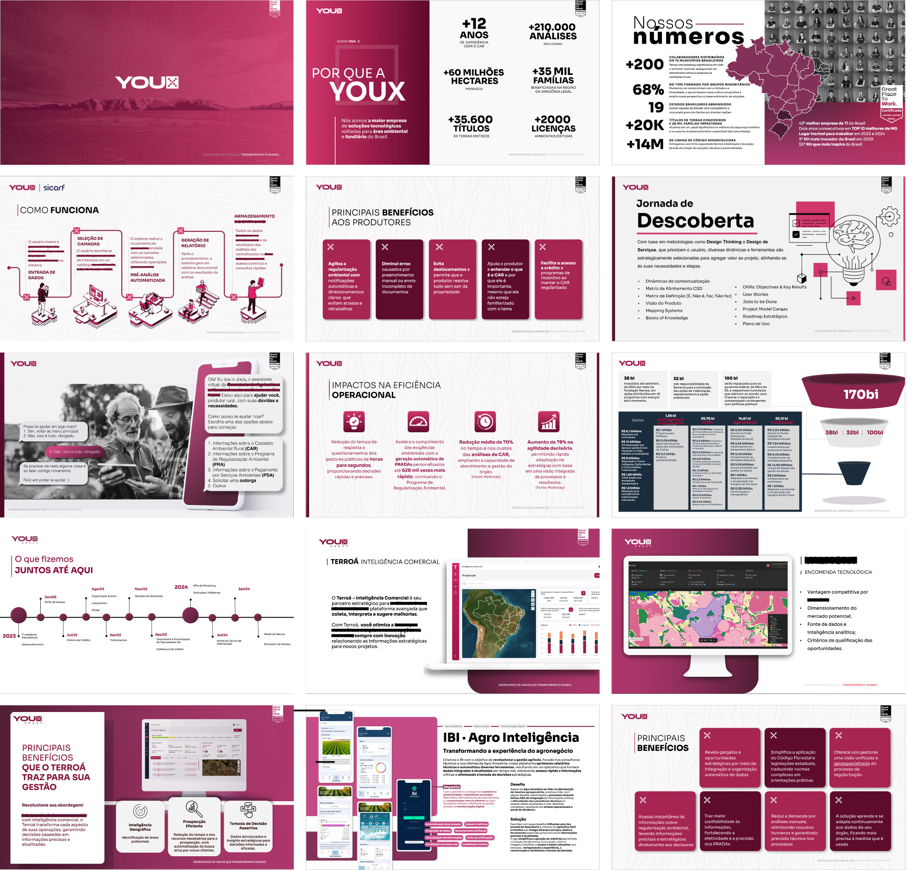
The redesign helped reposition the brand perception
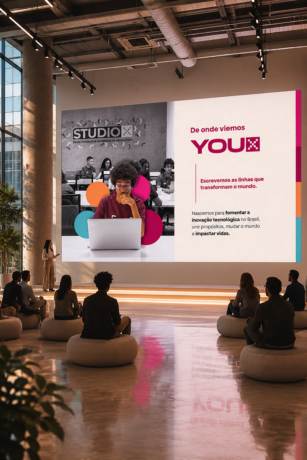
I introduced a more refined narrative flow, with cleaner layouts, clearer storytelling and stronger visual direction, improving readability and elevating the perceived value of the company.
Besides, replacing the low-contrast layouts with a clearer and more minimal structure, the presentations became more aligned with the company’s innovation-driven positioning.
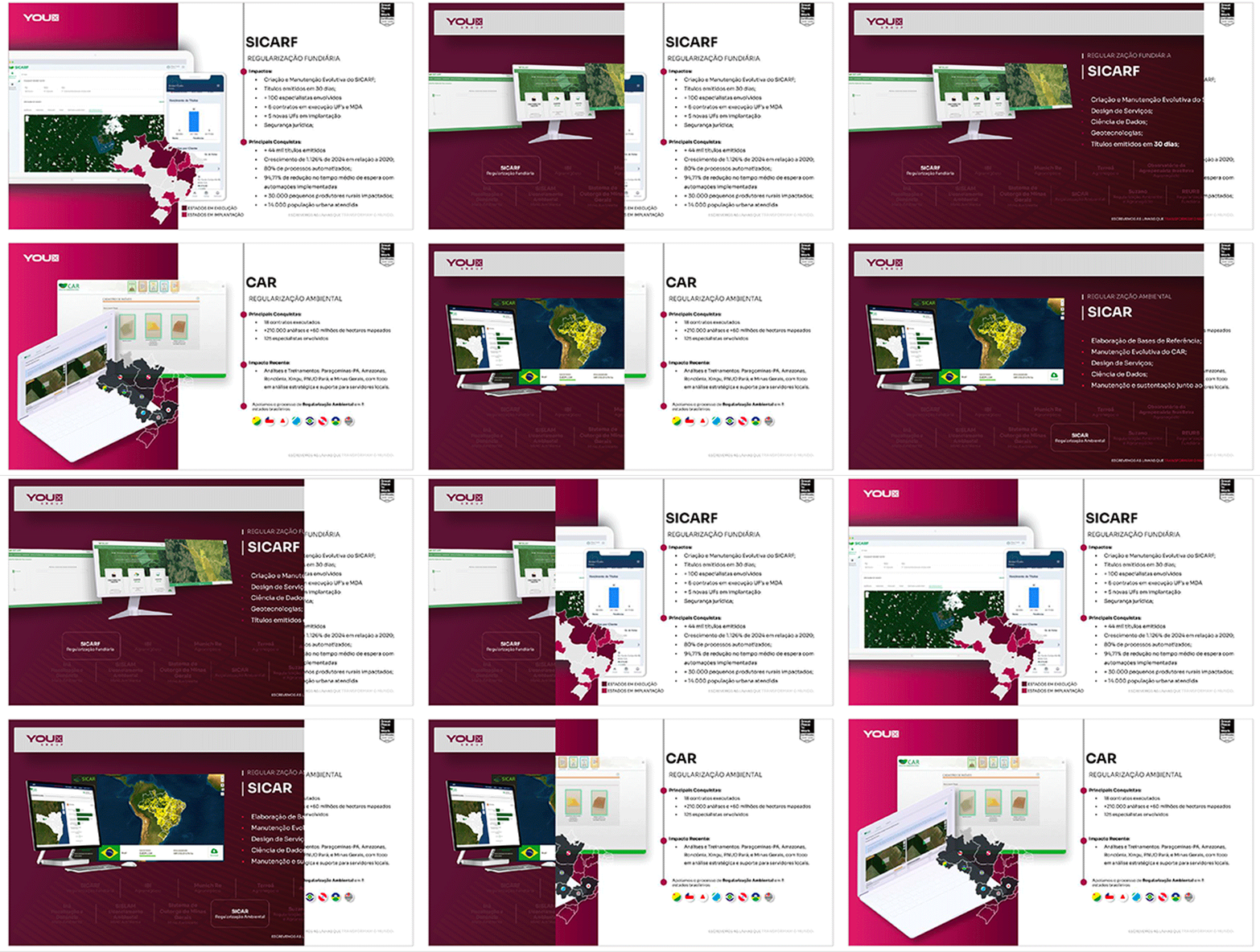
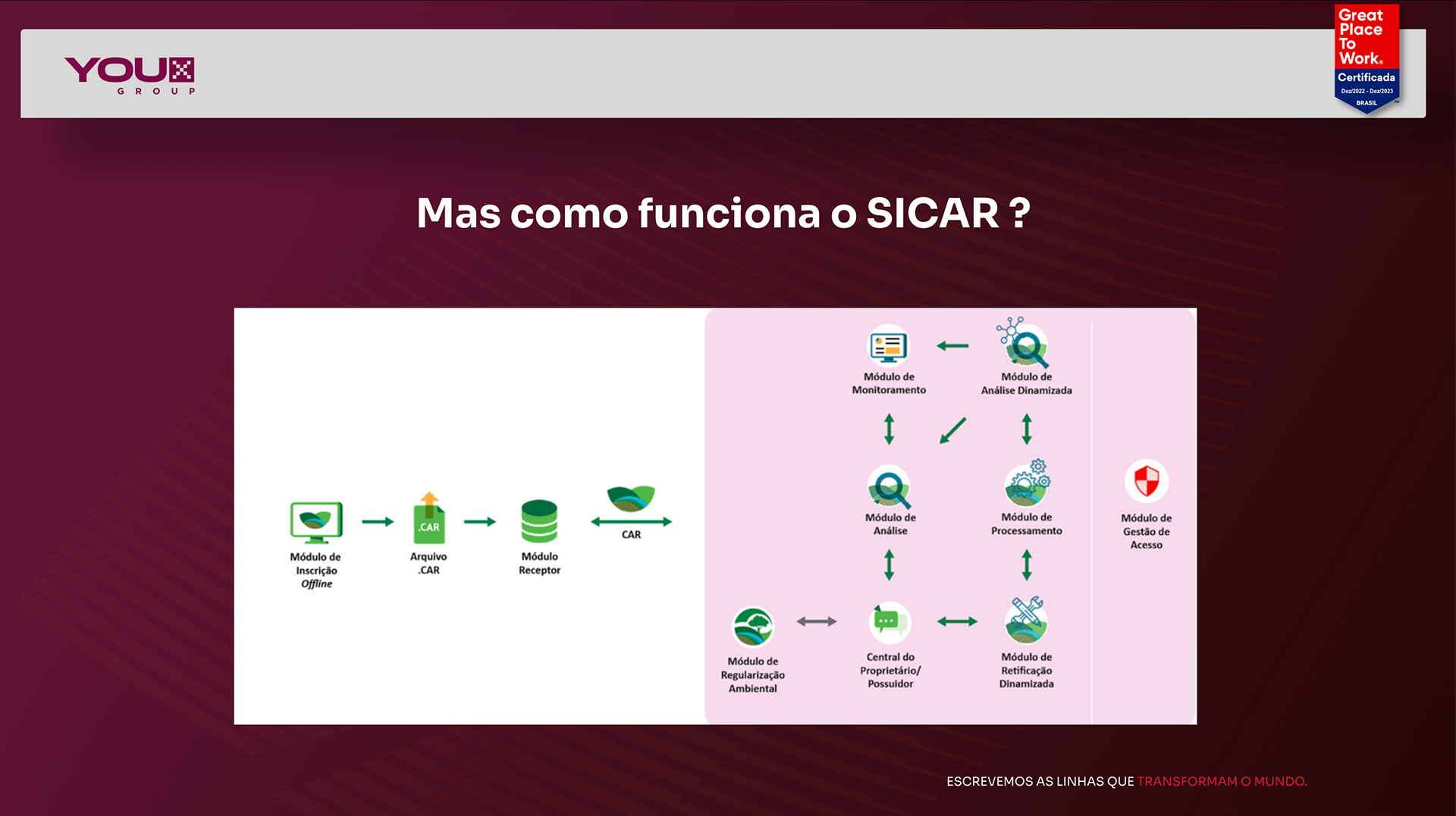
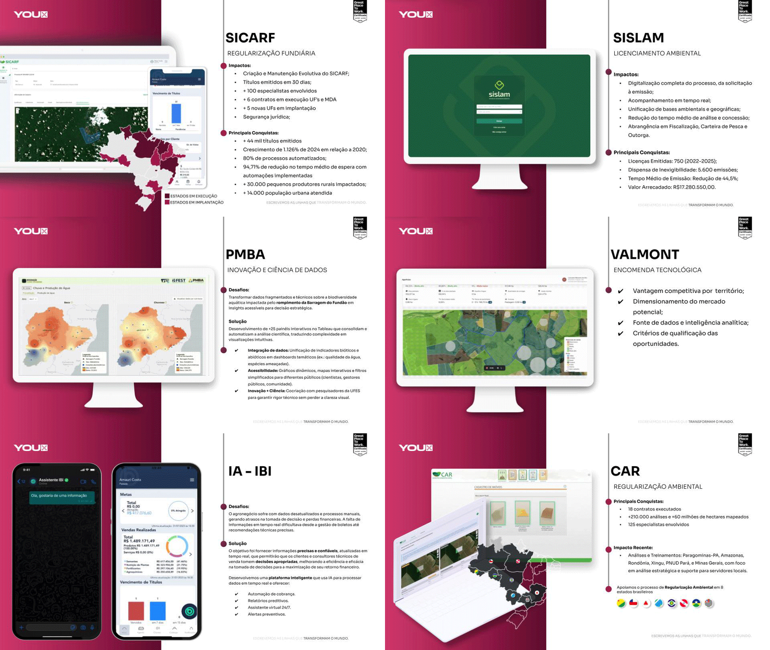
Cases presentations designed to transform technical content into compelling visual narratives, communicating products, partnerships and company expertise through an elegant storytelling and structured information flow
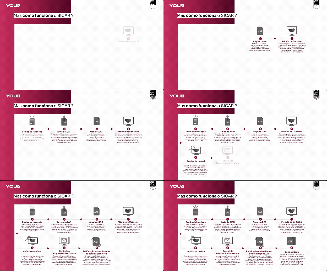
Technical product flows were often complex for non-technical audiences
Minimal layouts combined with infographic structure and subtle motion animations helped simplify highly technical workflows, improving comprehension without oversimplifying the product itself. This way, the new presentation system made the information significantly easier to follow and understand.
Transitioning from dark and visually overloaded slides to a lighter and more strategic visual language helped reinforce a more confident, contemporary and authentic identity for the company -- transforming the presentation into a more sophisticated and strategic sales tool.
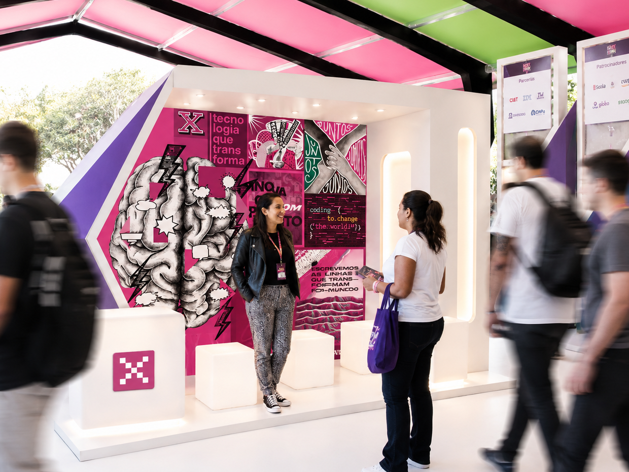
INSTITUTO YOUX
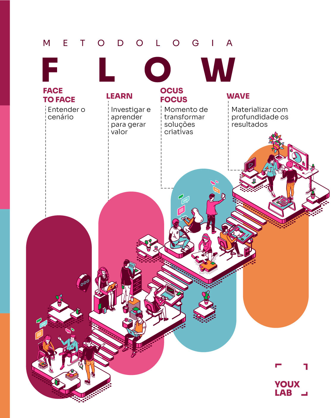
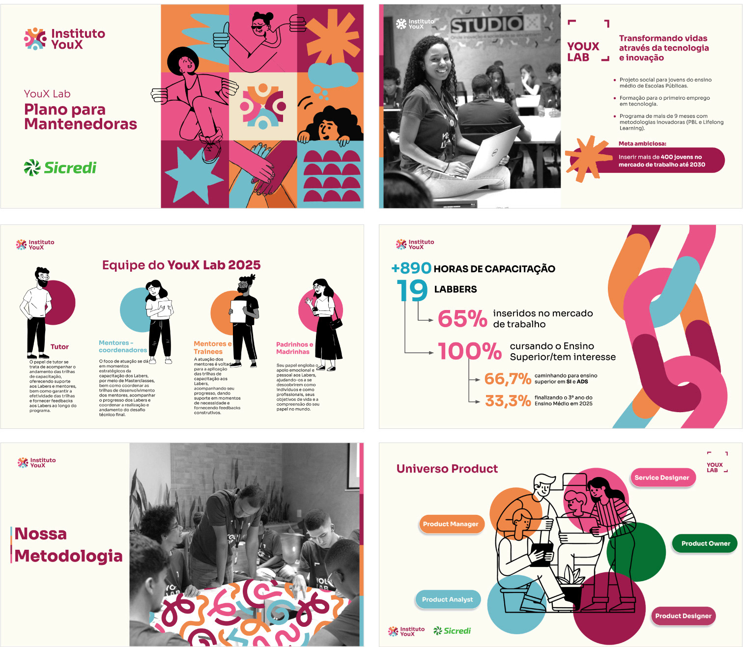
Presentation layouts and visual materials created for Instituto YouX, a social initiative focused on educational and technological accessibility projects (you can check additional communication materials here). ✱ LINK
The visual system was designed to be capable of balancing institutional communication and social engagement at the same time: communicating social impact, data and project credibility for partners and sponsors, while still feeling approachable and visually engaging for the young audiences involved in the initiative.
By combining structured information design, contemporary visual systems and clear storytelling, the presentations translated complex institutional content into educational human-centered communication and a cohesive and approachable narrative system.
*Some information has been altered and/or omitted for confidentiality purposes.
*The project was developed with support from my intern Yulla, who grew tremendously alongside this visual journey.