A MARIA QUE O BRASIL ESCOLHEU
THE MARIA THAT BRAZIL CHOSE
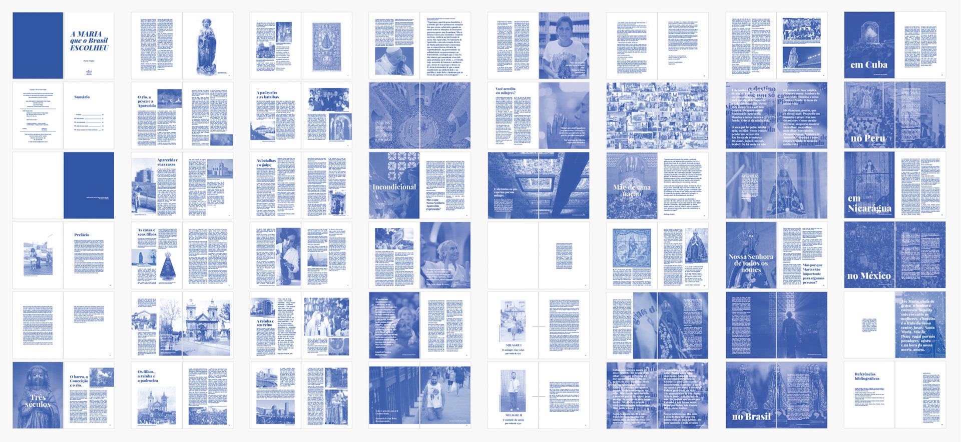
Developed as my undergraduate thesis in Graphic Design, this publication combines editorial design, historical research and visual culture studies to explore the relationship between faith, collective memory and national identity through the figure of Our Lady of Aparecida.
PROJECT INFORMATION
124-page editorial publication
16 × 22 cm (6.3 × 8.7 in)
Softcover edition
Printed prototype simulating single-color risograph production
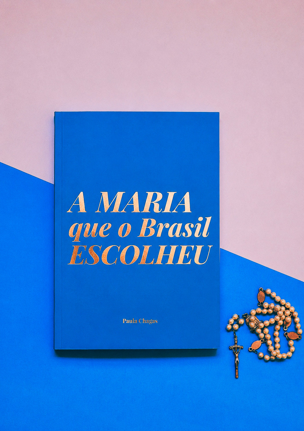
Monochromatic blue palette (#39559F)
Gold foil stamping simulation on cover
Cover stock: Color Plus Grécia 180g
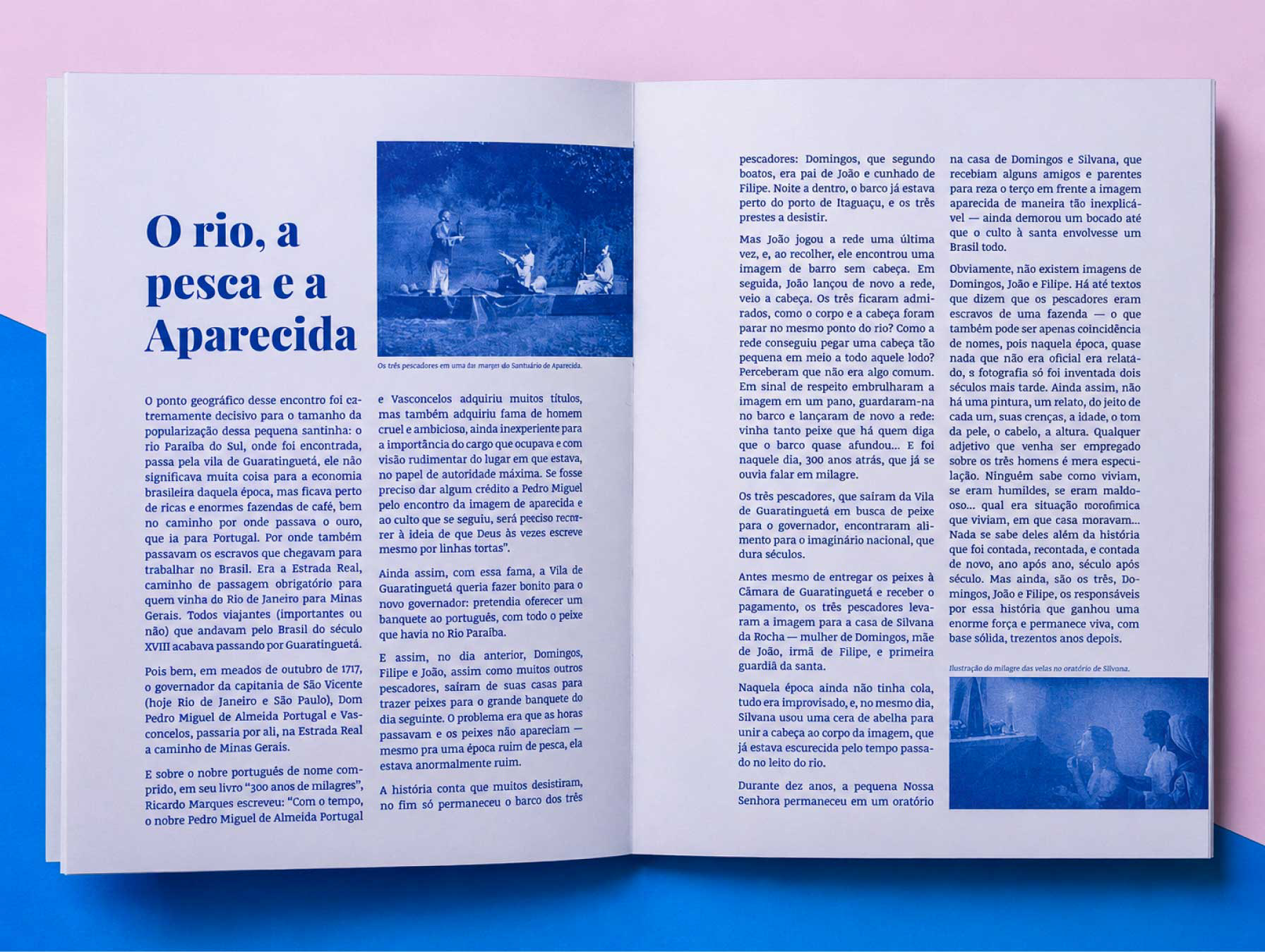
Interior stock: AP 120g uncoated paper
CONTEXT
Growing up in a traditionally Catholic family revealed something that extended far beyond religion: millions of Brazilians, from different backgrounds and beliefs, shared a deep connection with the same female figure. This observation became the starting point for a broader investigation into feminine sacred imagery and its role in shaping cultural identity across Latin America.
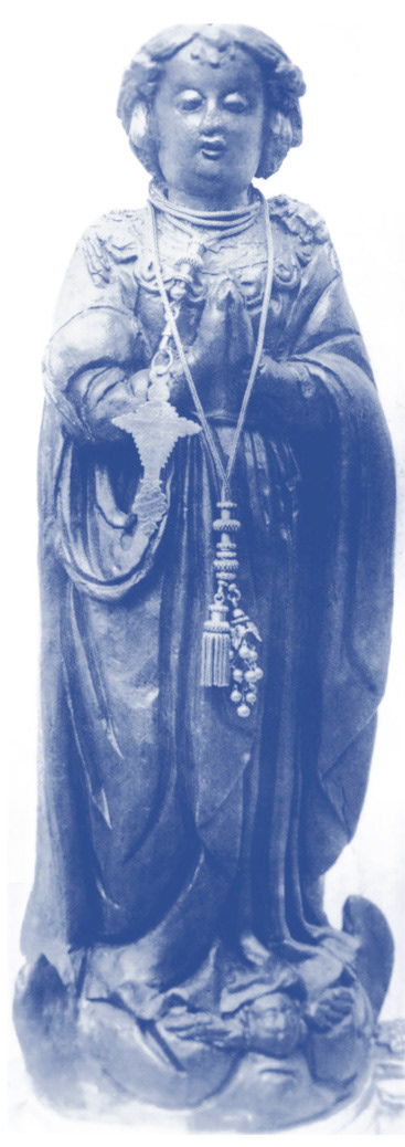
Over three centuries, the small clay statue found by fishermen in the Paraíba do Sul River transformed from a local devotion into one of the strongest visual and symbolic representations of Brazil itself. Through this process, the figure of Mary became intertwined with narratives of race, belonging, motherhood, resistance and nation-building.
CONCEPT
The central concept of the project: "Icon of the People" examines how a religious image can transcended institutional boundaries and become part of a nation's collective imagination.
Rather than focusing exclusively through official Church narratives, the research investigates how popular devotion transformed Aparecida into a cultural symbol that belongs, not only to the Church, but to an entire nation.
At the same time, the publication became an early exploration of feminine sacred imagery as a recurring visual language that expands beyond the Brazilian context, investigating Marian representations across Latin American cultures.
RESEARCH SCOPE
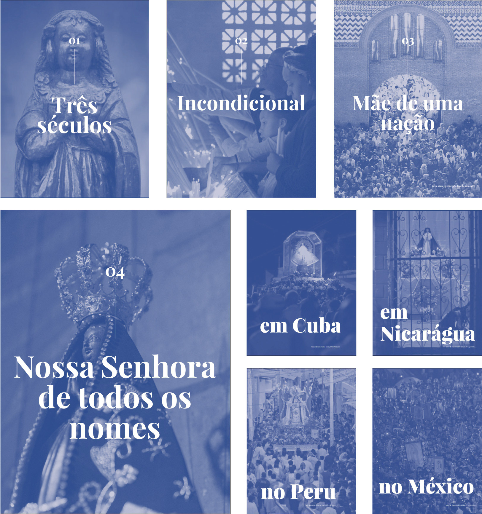
Editorial design was used not only as a medium for communication, but also as a research methodology. Through the organization of historical narratives, archival imagery and visual references, the publication creates connections between faith, memory and identity, allowing readers to navigate complex cultural histories through visual storytelling organized into four thematic chapters:
1. Three Centuries: tracing the historical trajectory of Aparecida from the discovery of the statue in 1717 to its consolidation as the patron saint of Brazil.
2. Unconditional: investigating the experiences, rituals and testimonies of devotees, focusing on the human dimension of faith.
3. Mother of a Nation: examining the role of Aparecida in the construction of Brazilian cultural identity beyond institutional religion.
4. Our Lady of Every Name: exploring Marian representations throughout Latin America and their relationship to local histories, traditions and communities.
FEMININE ICONOGRAPHY IN LATIN AMERICA
Despite their many names, historical contexts, local traditions, appearances and visual forms, these female figures consistently embody collective ideas of motherhood, hope protection, resilience, and feminine strength in different cultures.
GRAPHIC PRODUCTION
The visual system draws inspiration from the "Sala dos Milagres" (Room of Miracles) at the Basilica of Aparecida: a space filled with the material culture as photographs, letters and personal objects left by devotees.
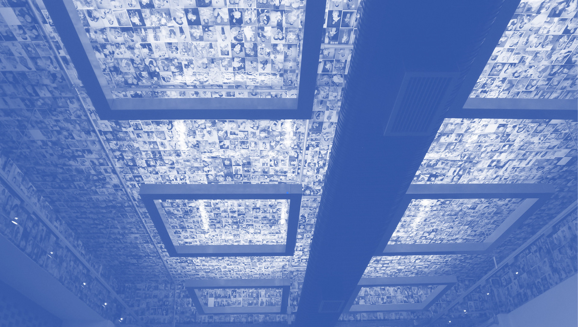
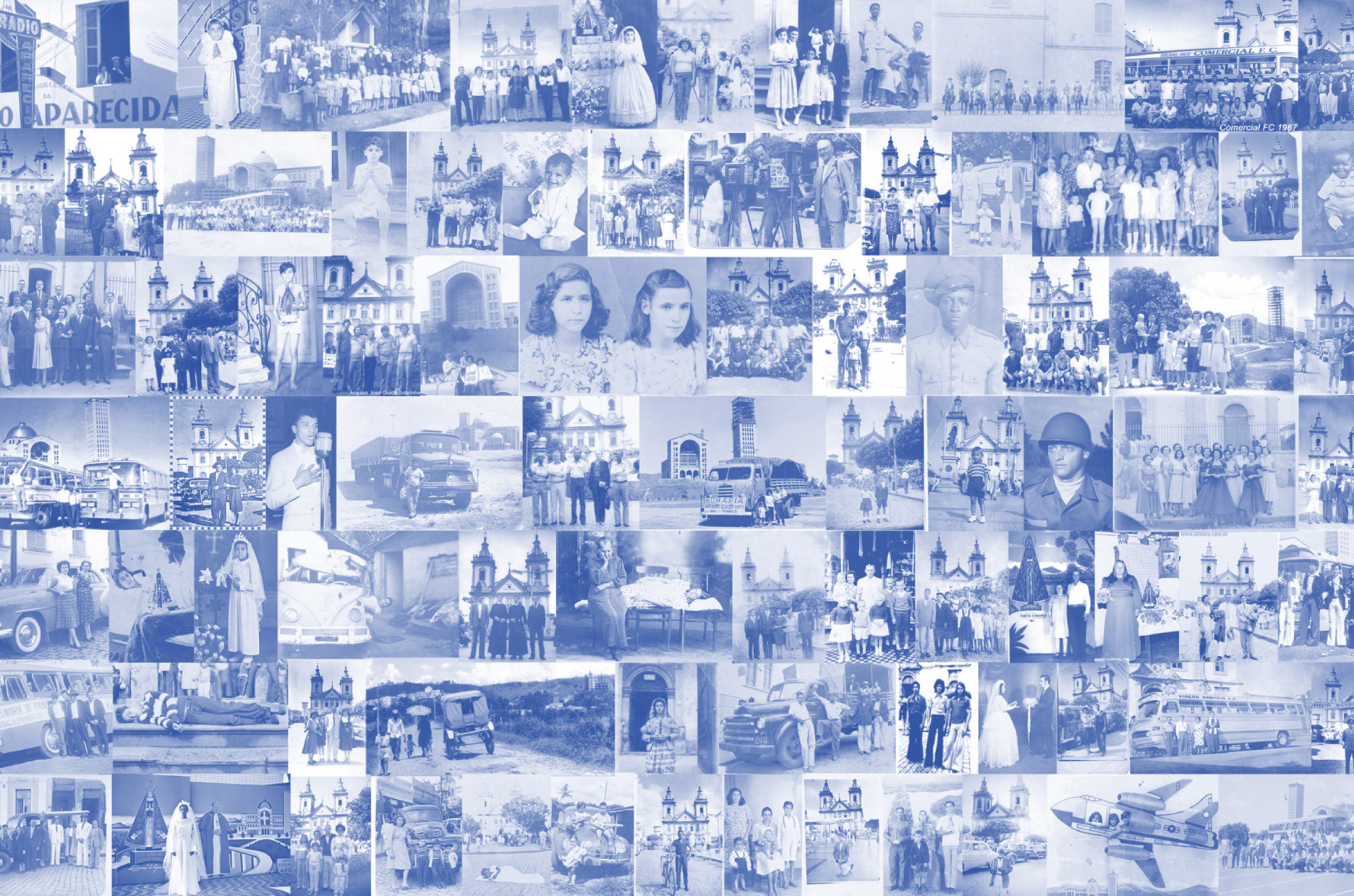
Functioning as a collective expressions of faith archive, this environment informed the project’s visual approach, which combines documentary imagery, family-album aesthetics and archival references.
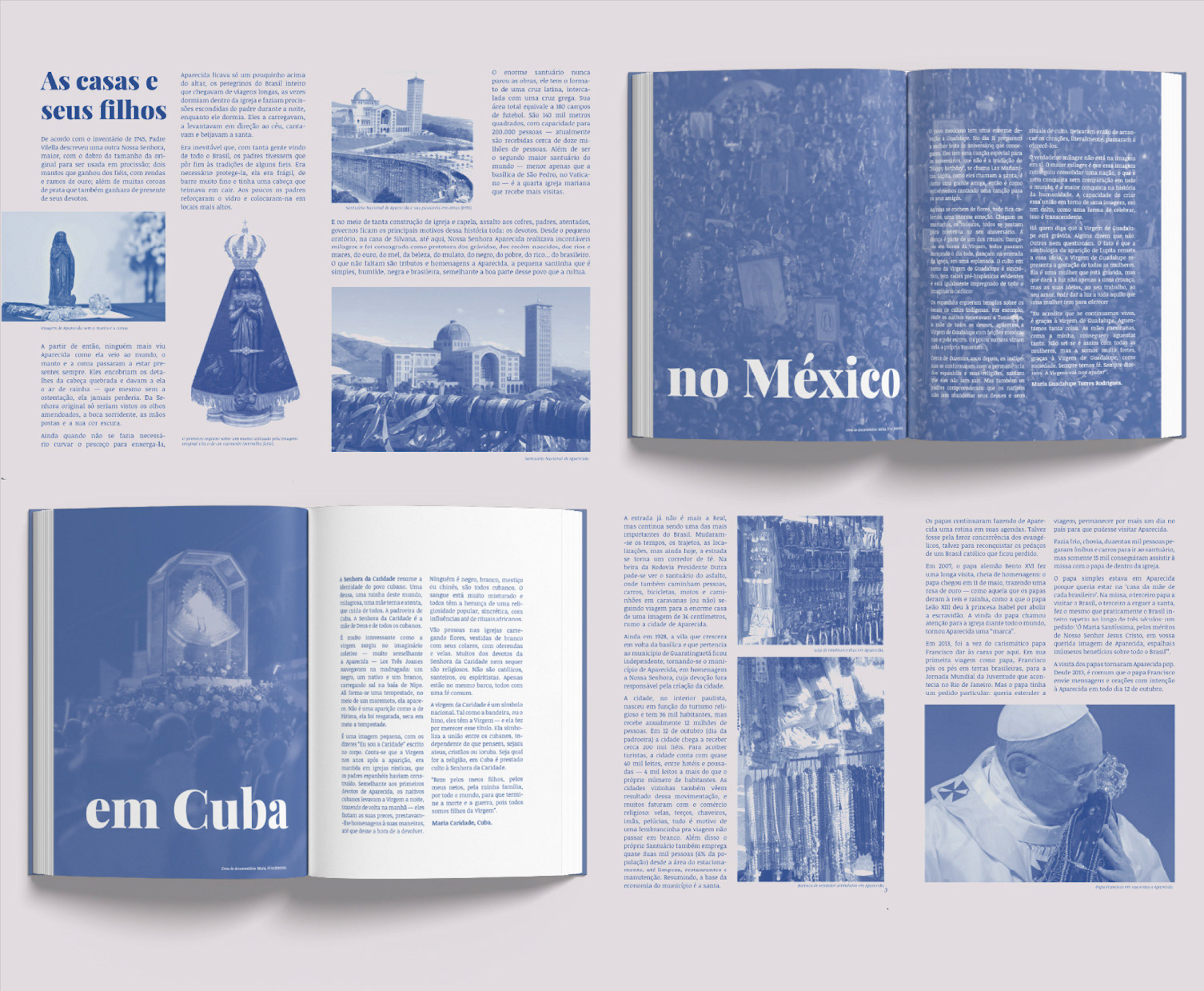
The modular grid system was designed to accommodate multiple narrative formats, allowing historical documents, photography, testimonies and editorial essays to coexist within a flexible visual structure.
TYPO
Typography also plays a central role in the narrative. The use of Playfair Display Black establishes a visual balance between strength and delicacy, reinforcing themes of feminine power, resilience and care that permeate the publication.
PRINTING
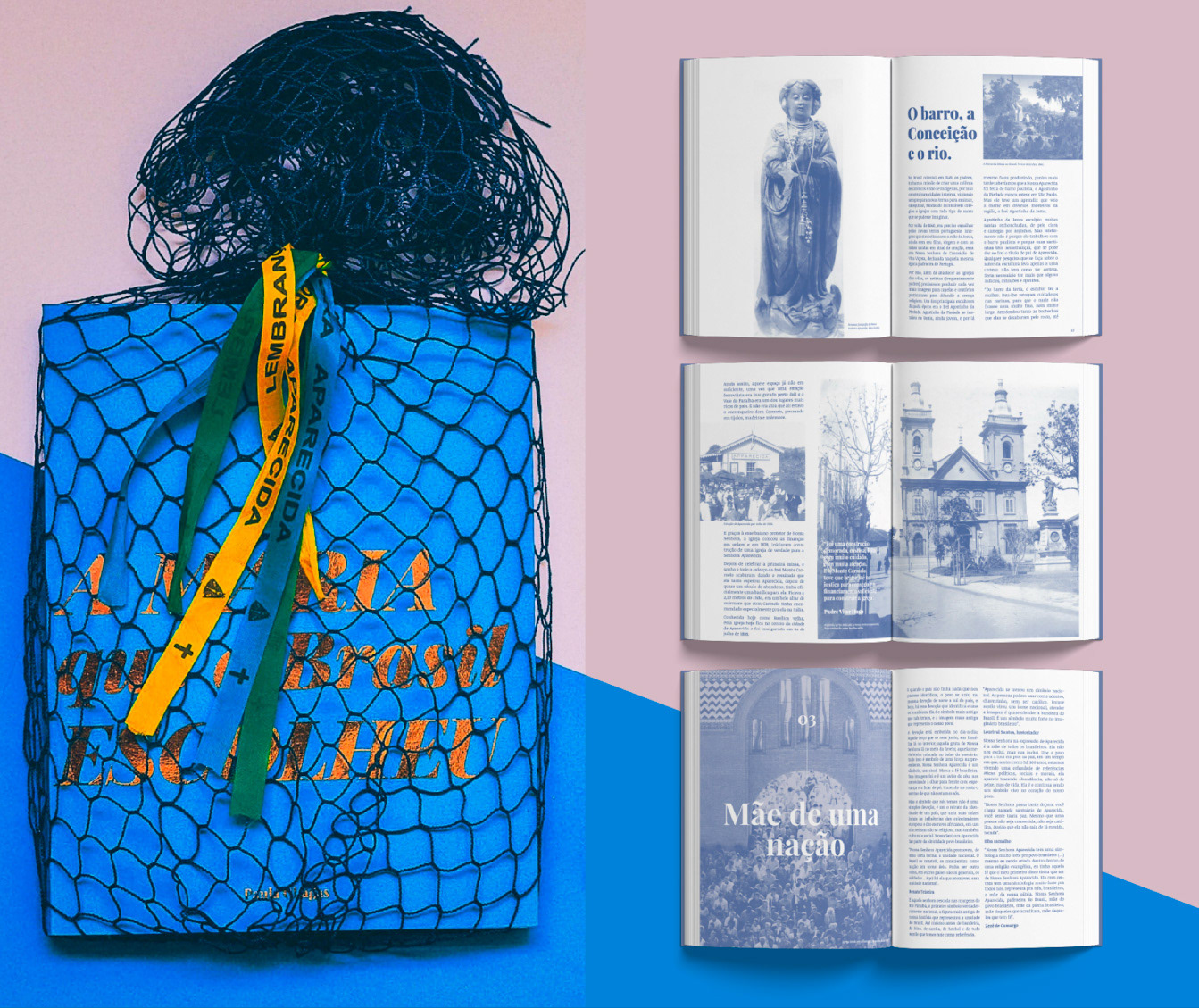
The publication was conceived around the aesthetics and limitations of the inexpensive single-color risograph printing. Beyond a production choice, the process became a conceptual extension of the project itself: an affordable and widely accessible printing method that reflects the popular origins of Aparecida's devotion. Besides, the publication adopts a monochromatic blue palette, referencing both the traditional mantle of Our Lady and the economical printing processes commonly found in material culture visual language of these popular printed artifacts like eryday religious publications, particularly single-color church pamphlets and liturgical handouts.
OBJECT BOOK
Material choices reinforced the project's central concept: the combination of an uncoated interior stock with a flexible cover and metallic gold foil created a balance between accessibility and symbolism, echoing the contrast between popular devotion and sacred imagery.
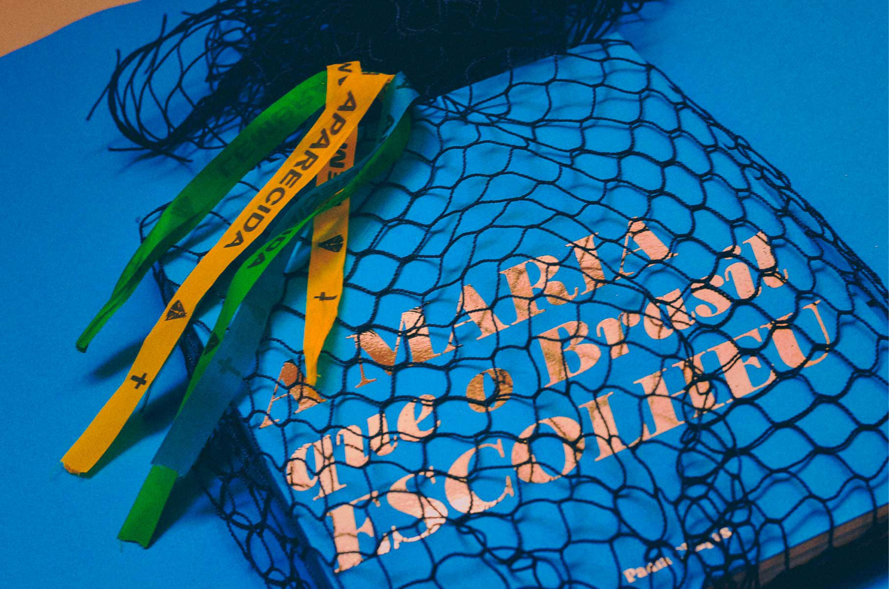
The project extends beyond the printed page: wrapped in a fishing net — referencing the discovery of the statue in 1717 — and accompanied by traditional devotional ribbons sold throughout Aparecida, the book was conceived as a physical artifact connected to the material culture surrounding the devotion itself.
*Historical research was conducted through books, documentaries and archival materials focused on Marian devotion, Brazilian cultural identity and the history of Our Lady of Aparecida. Key references included works by Rodrigo Alvarez and Ricardo Marques, alongside documentary sources examining the social and cultural impact of Aparecida throughout Brazil.