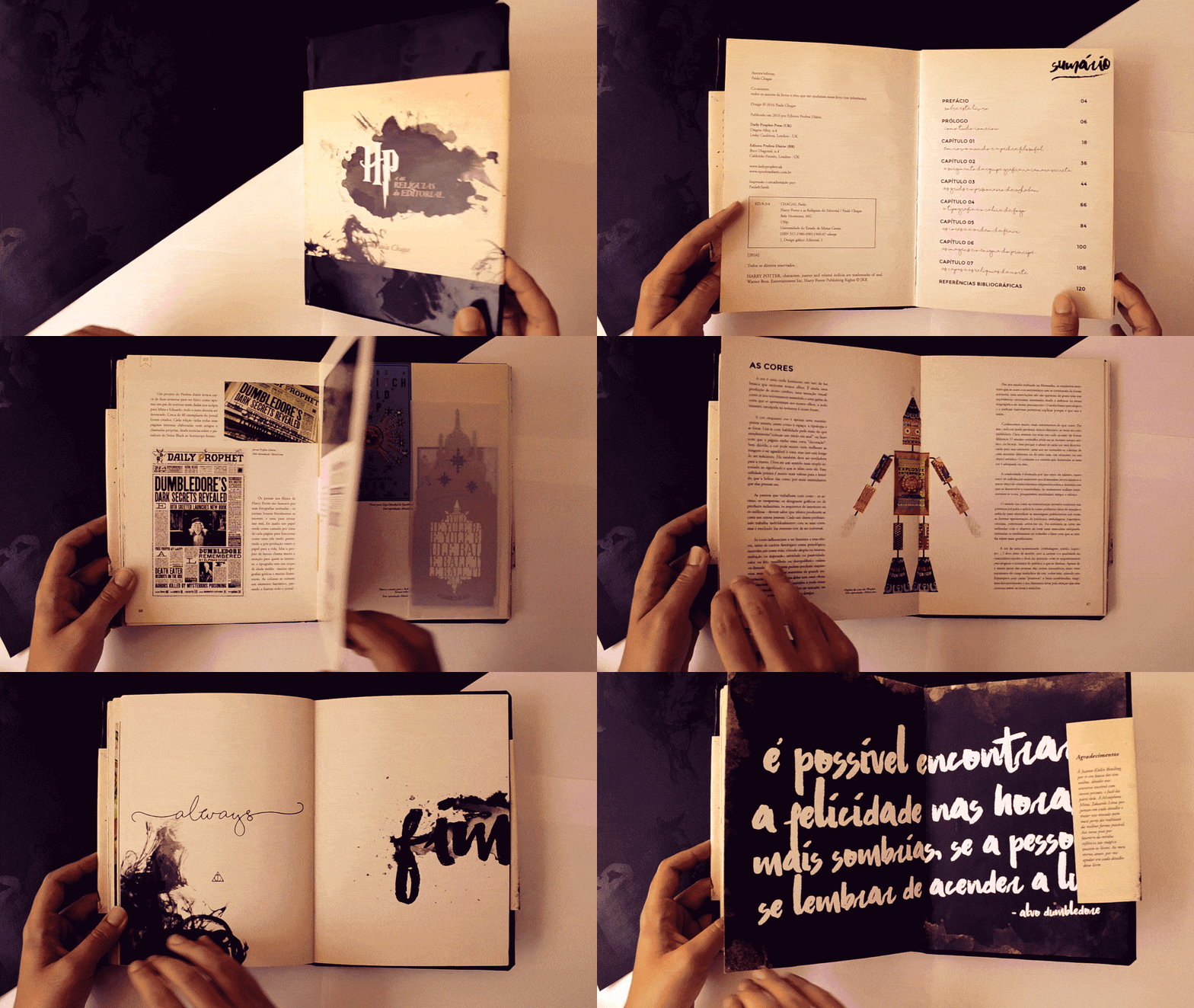
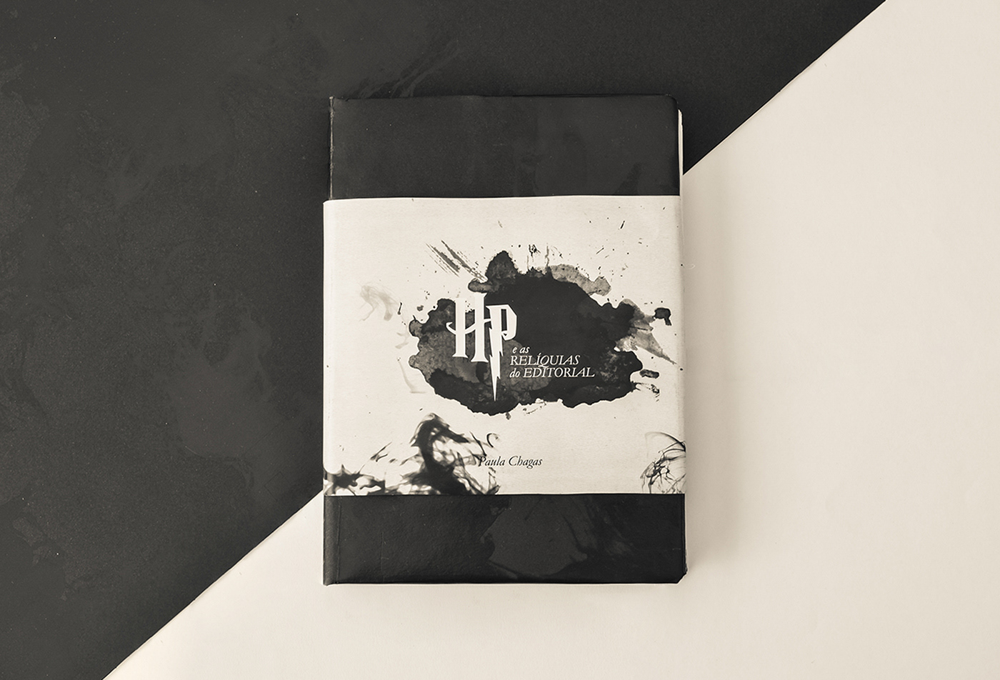
Developed in 2015 as part of an undergraduate editorial design course, this is one of my earliest academic projects (and probably one of the pieces I would redesign the most today), but still, for me, it is a very important project because it analyzes the graphic pieces created for the Harry Potter films to investigate how editorial design shapes narrative, atmosphere, and visual identity.
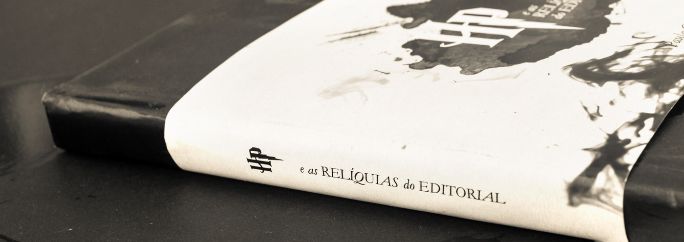
Size: 16x22 cm / 124 pages
Cover: Black printing oil based
on Color Plus black paper
Dust-jacket: Gloss couche 150g
Internal pages: Matte couche 150g
This wasn't born from just being a Harry Potter fan, but from noticing (as I grew up) how graphic artifacts in the films helped build an entire visual universe. As I began studying design, I realized that newspapers, posters, letters, typography, and printed materials weren't simply props; they were essential storytelling devices. This project became an opportunity to explore how editorial design contributes to world-building and visual narrative.
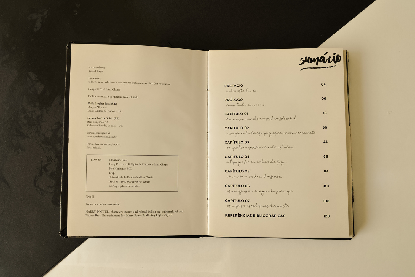
THE CHAPTERS
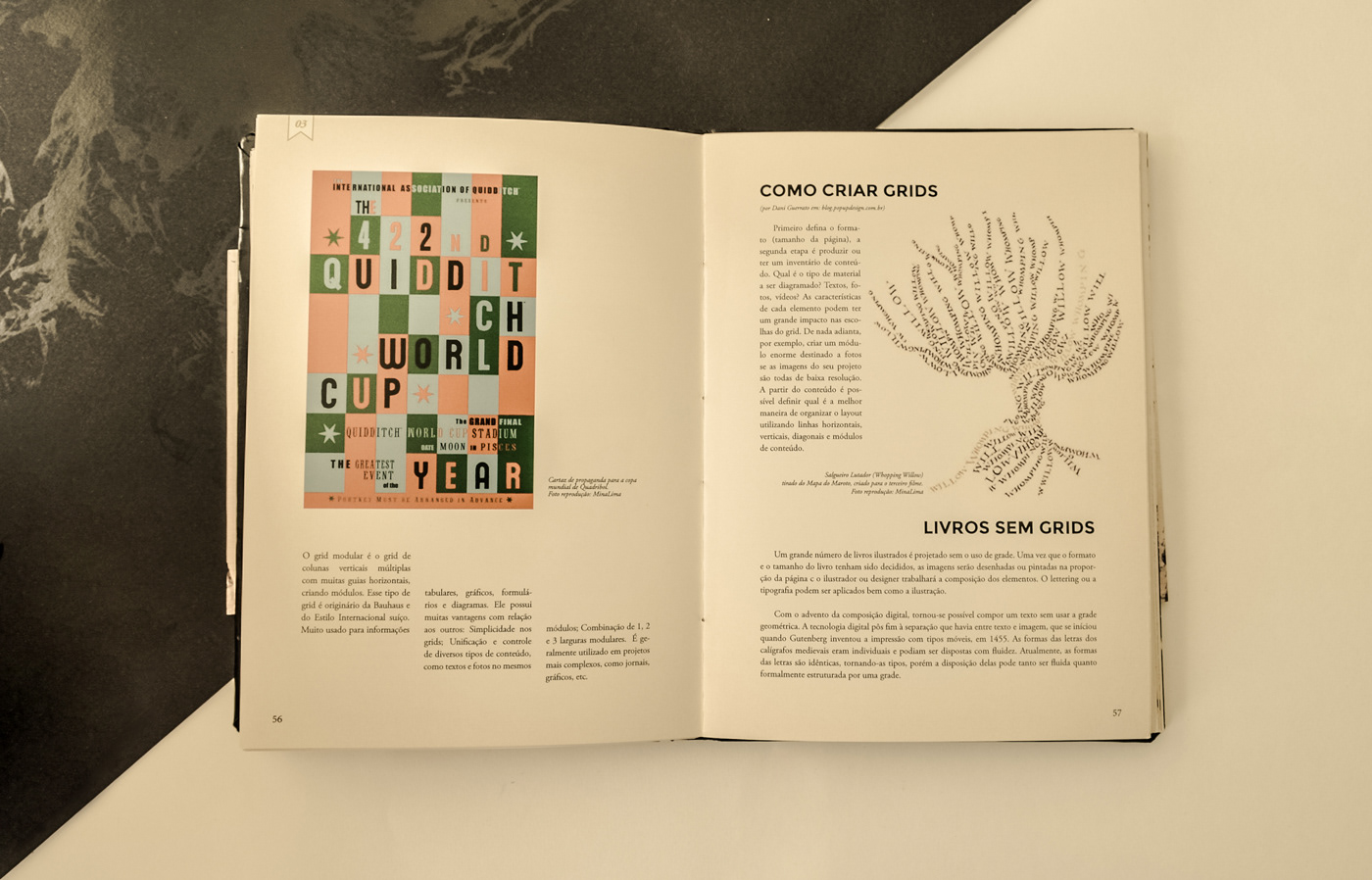
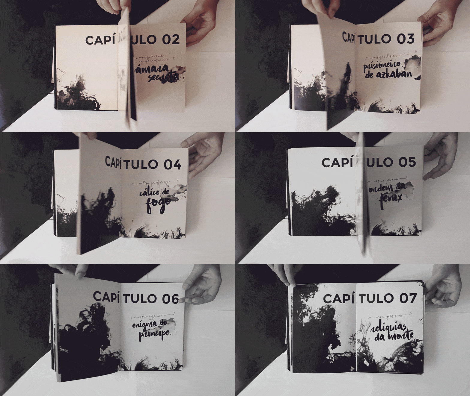
The publication is divided into seven chapters, mirroring the seven books in the series. Each chapter explores a different editorial design principle through the analysis of a specific film and its graphic artifacts.
And, using original materials produced for the film series, the book examines how editorial principles can be translated into cinematic storytelling.
GRIDS
txt
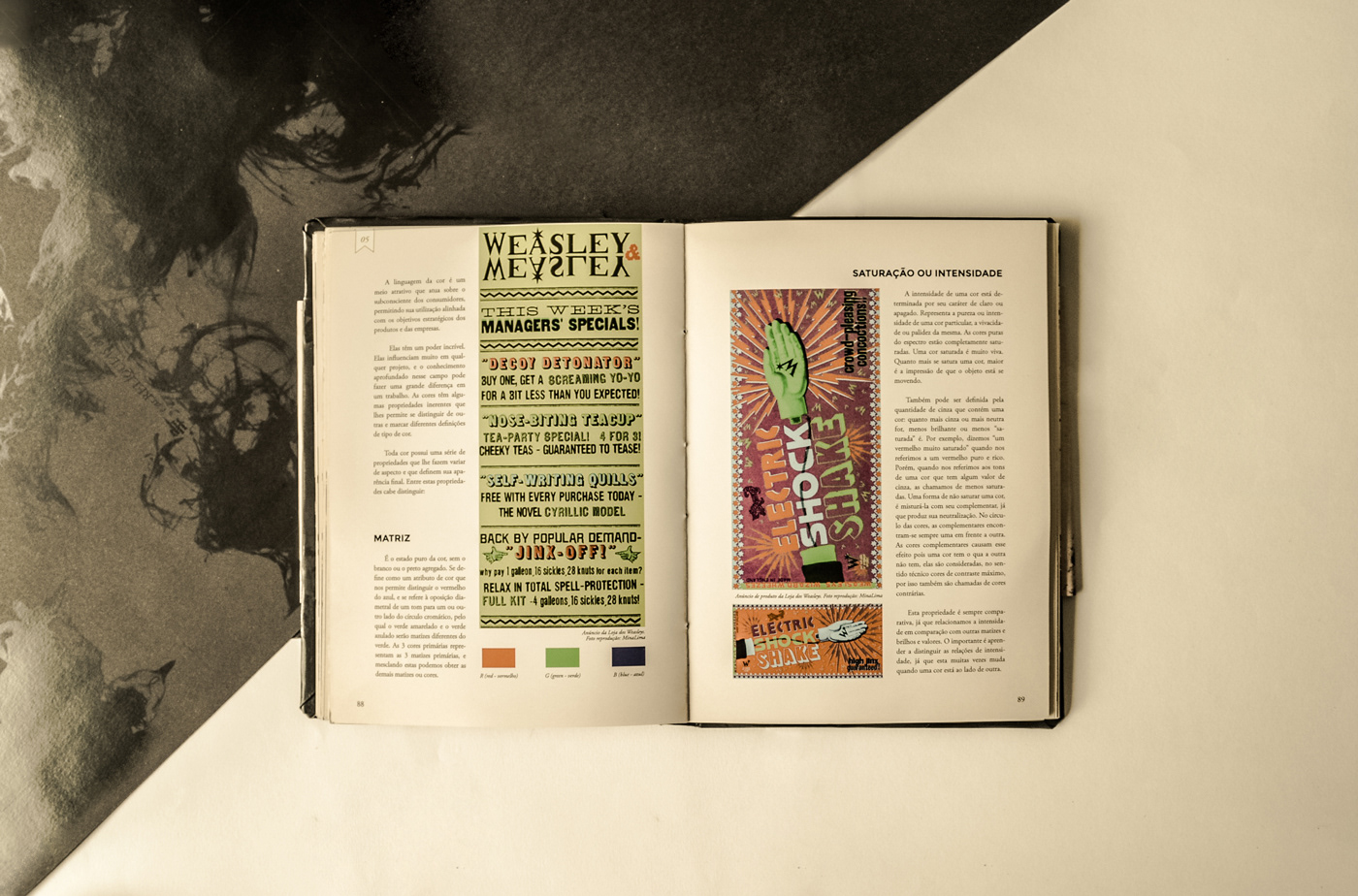
COLORS
As the story evolves, the visual language of the films gradually becomes darker and more restrained. This transition is reflected throughout the book through graphic elements inspired by Dementors and Death Eaters, visually representing the growing influence of dark magic across the series.
TYPOGRAPHY
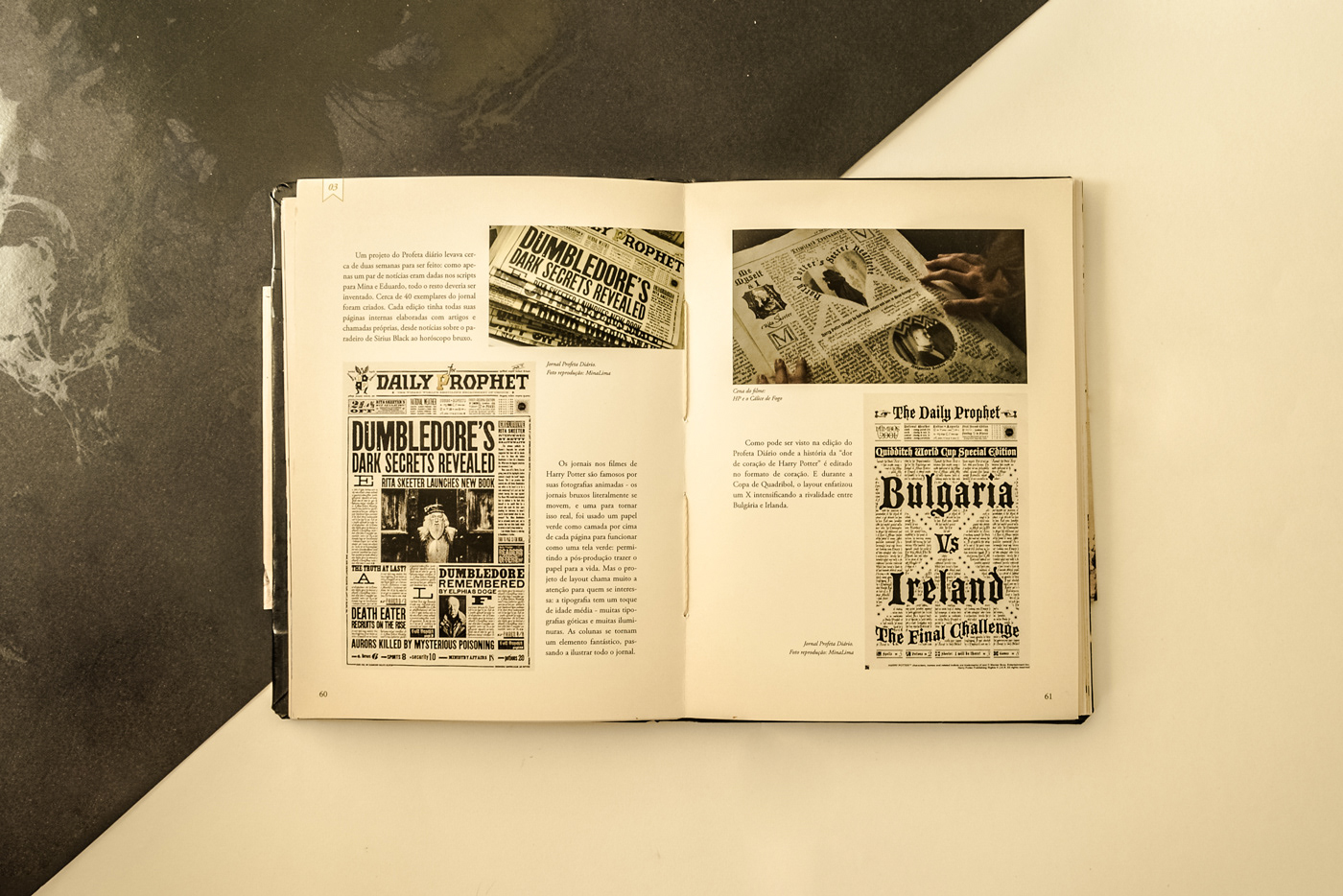
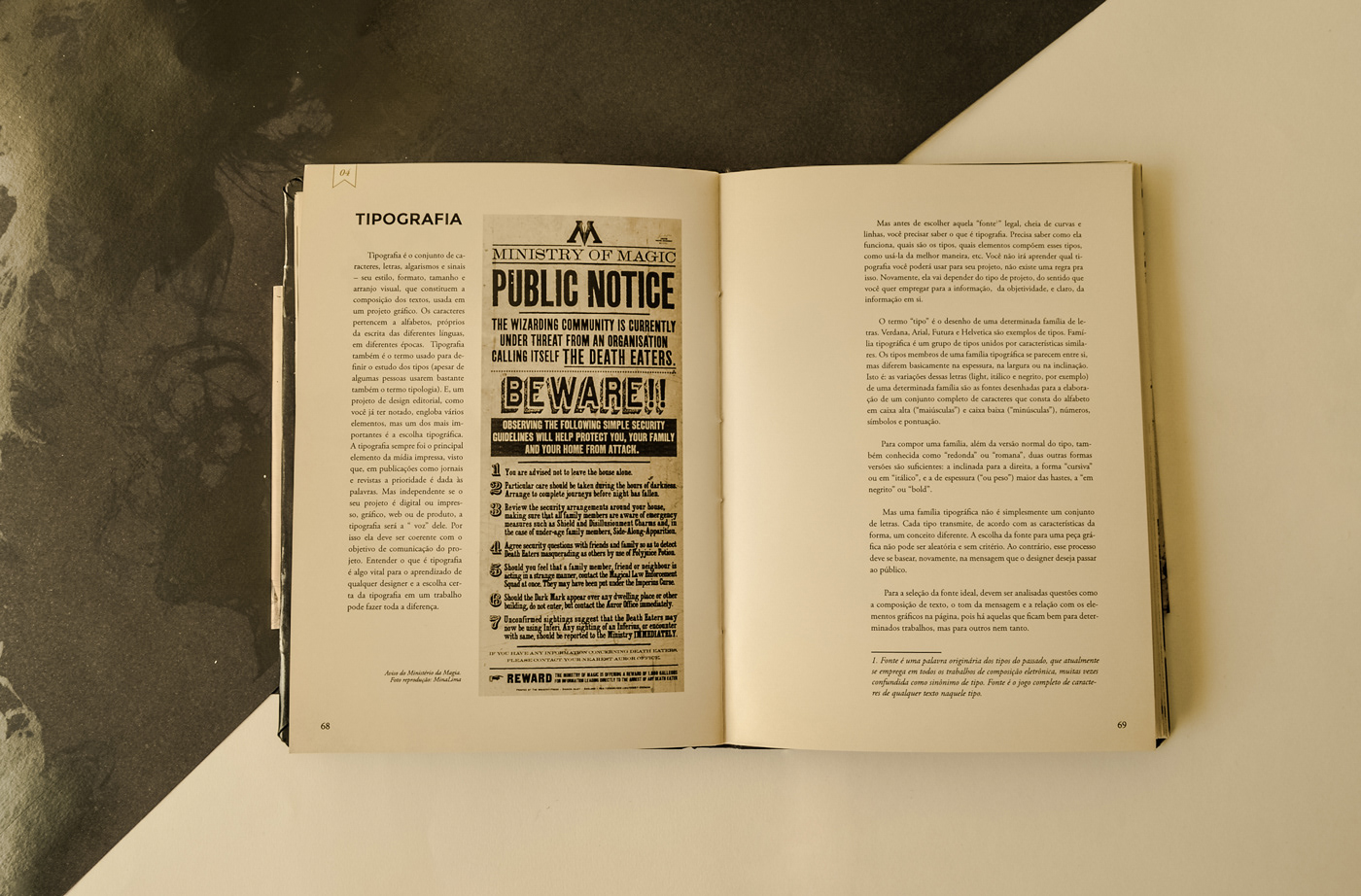
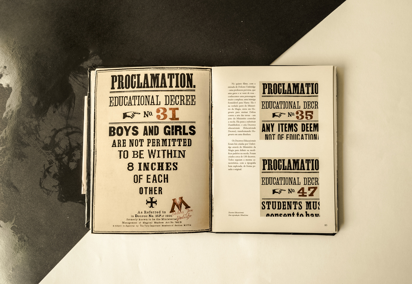
Different typographic systems were analyzed to understand how type contributes to the identity of each fictional publication, location, and historical context within the films.
GRAPHIC PRODUCTION
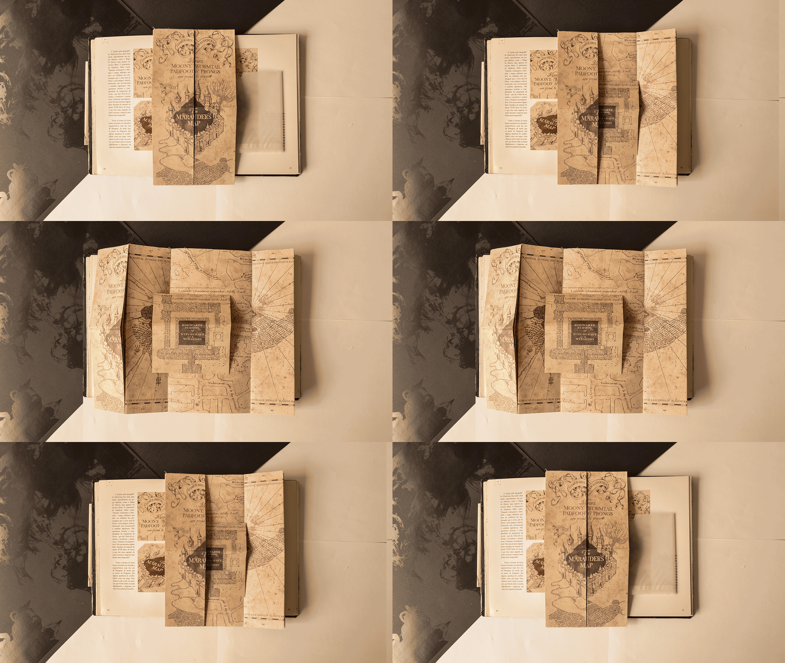
The publication also incorporates reproductions of printed materials featured in the films, including the Marauder's Map, the Hogwarts acceptance letter, and the Yule Ball invitation.
Most of these original graphic pieces were designed by Miraphora Mina and Eduardo Lima, who later foundedMinaLima, the London-based studio responsible for much of the graphic design developed throughout the film series.
txt
For me, Harry Potter will have the same fate of Pinocchio, Peter Pan, and various other stories. It will be a familiar story with a moral, a legacy, going forward the various values that the characters taught us: the value of friendship, trust, willpower, but above all, it is our choices that define the way forward and who we are or who we will be.
"These magical universes also make us fall in love because we are not required to enter. The door is opened and we spied for suspecting that there we will have fun, it will scare us and we will have contact with the human dimensions that only literature can give us".
Mário Corso, Carta Capital.
Thanks to Miraphora Mina, Eduardo Lima and the whole scenario and creation team, to think of every detail and bring that world closer to reality as best as possible. Dedicated to all people around the world who grew up with this magical world! Especially my friends, to show every single day that the strength of a true friendship exists beyond the Hogwarts grounds.
“There are some things you can't share without ending up liking each other, and knocking out a twelve-foot mountain troll is one of them.”
J.K.R.