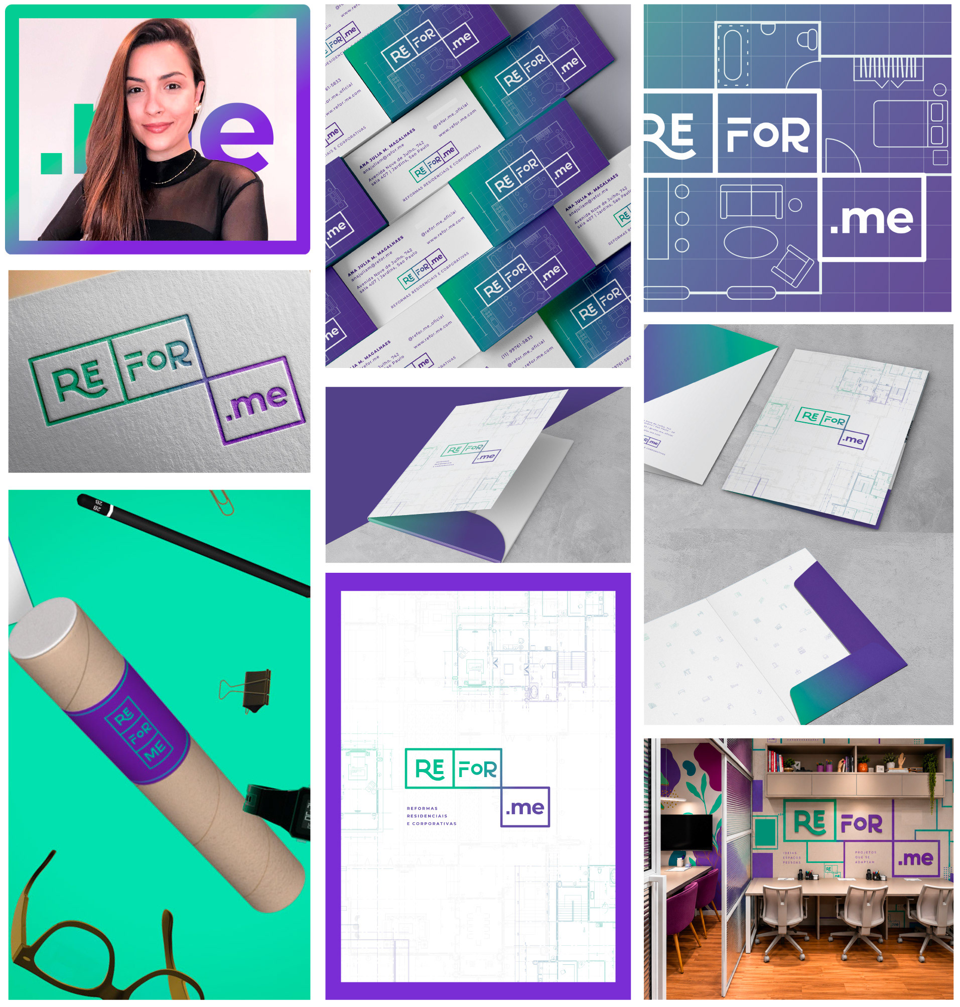
When Ana Julia approached me, the studio had no name, visual identity or established communication system; but Refor-me was born from her idea: to create an architecture studio with a more personal, accessible and collaborative approach to its clients. I helped shape that vision into a complete brand, from naming and positioning to visual identity, printed materials, digital experience and art direction.
DIRECT
ACCESSIBLE
YOUTH
YOUTH
PERSONAL
TECH-DRIVEN
The first challenge was to translate the architectural's proposition without becoming conventional. Rather than following architecture aesthetics (rigid grids and neutral palettes), I looked for a system that could communicate personality, technology and flexibility while still feeling connected to space and construction.
The name Refor-me emerged from this idea of transformation and personalization. It suggests something being reworked, adapted and ultimately made for “me”. A direct reflection of the studio's approach: creating spaces around the people who inhabit them.

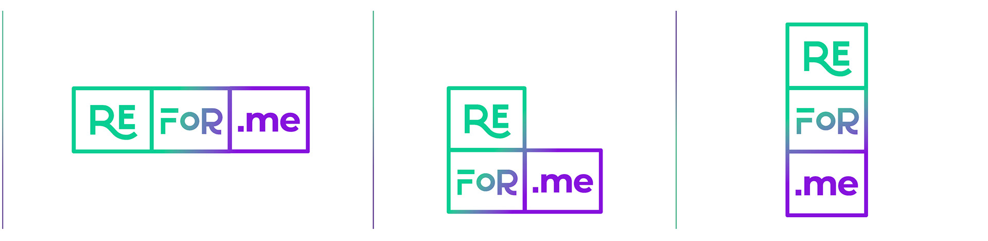
A VISUAL IDENTITY THAT MOVES
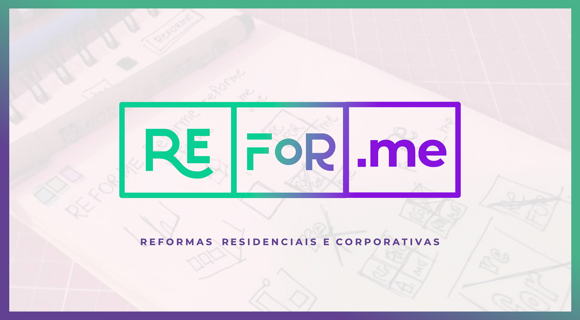
The logo system behaves like a space: it can be reorganized according to each context and each need.
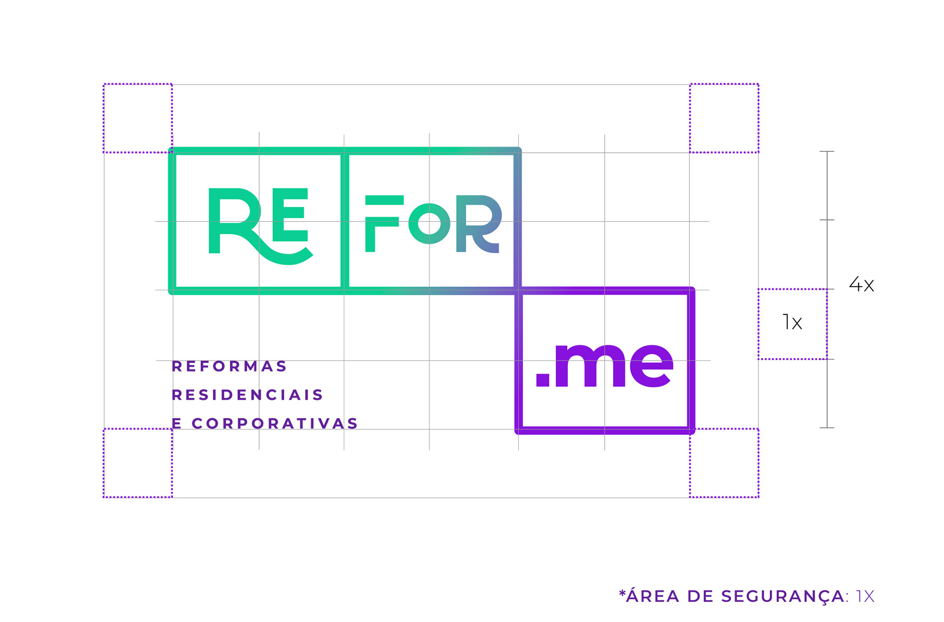
Each syllable of RE / FOR / ME occupies its own rectangular module, referencing the rooms and divisions of an architectural floor plan. But these modules aren't fixed. They can connect horizontally or vertically, overlap, separate or rearrange, creating different compositions while always remaining recognizable as the a brand.
This flexibility became one of the central principles of the visual system, allowing the brand to adapt across different formats and touchpoints.
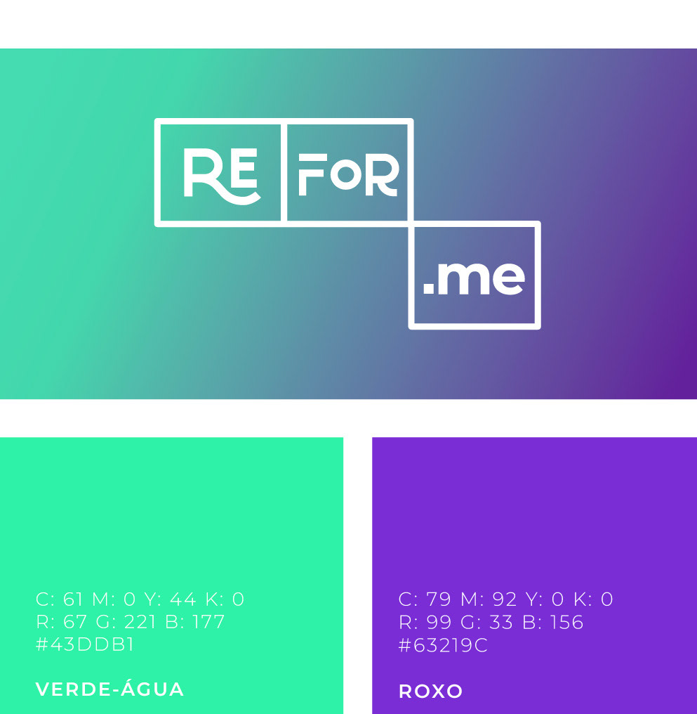
While the visual language combines architectural references with a younger, more contemporary aesthetic, a gradient palette moves between turquoise and violet, bringing together technology, creativity and a sense of transformation.
The result is an identity that feels architectural, but not expected: structured without being rigid, and professional without losing its own personality.
BRINGING THE SYSTEM INTO THE PHYSICAL WORLD
A flexible identity designed to adapt: just like the spaces Refor-me creates.
The modular logo allowed applications across stationery materials to become a slightly different composition while maintaining a strong visual connection across the system.
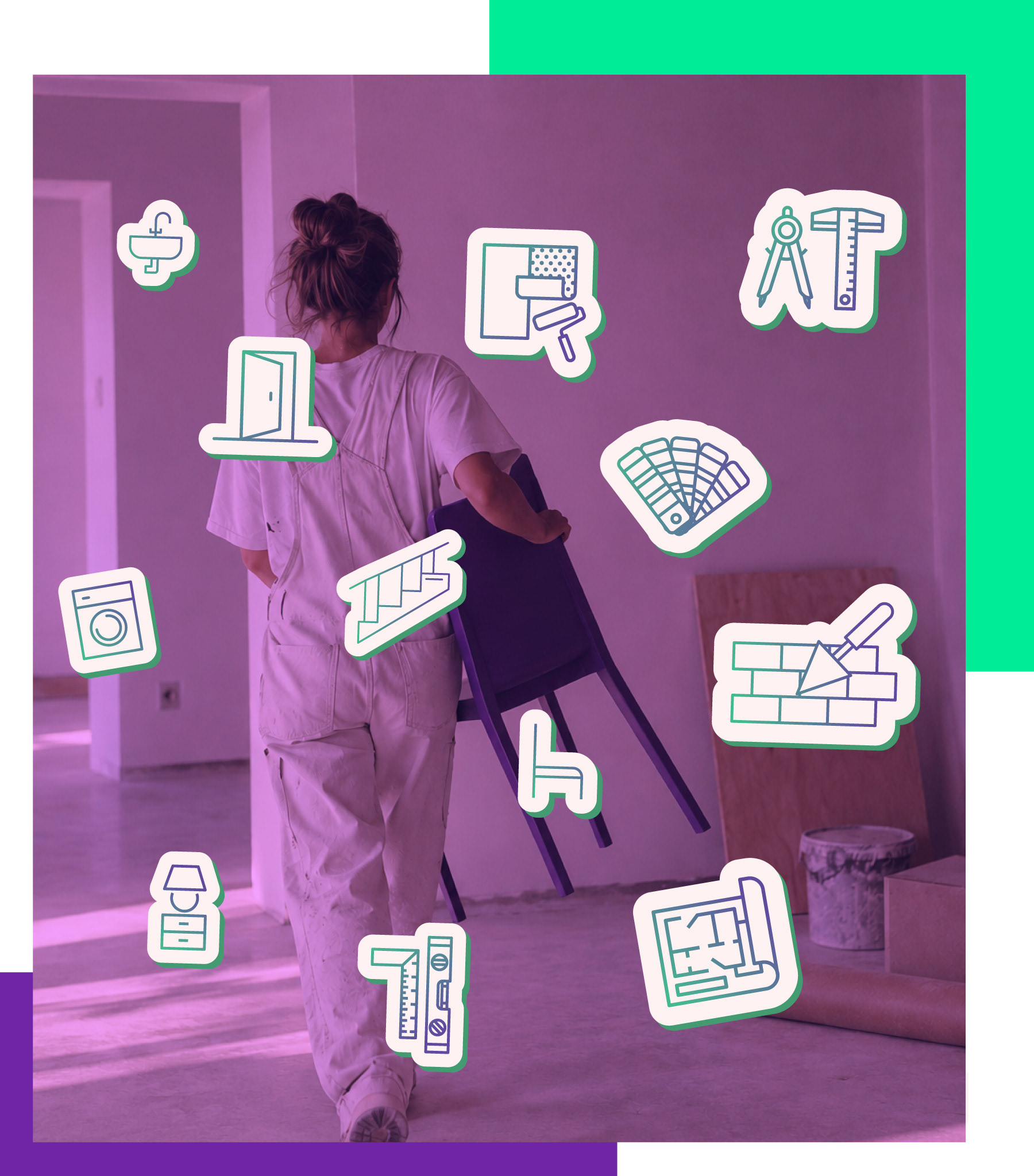
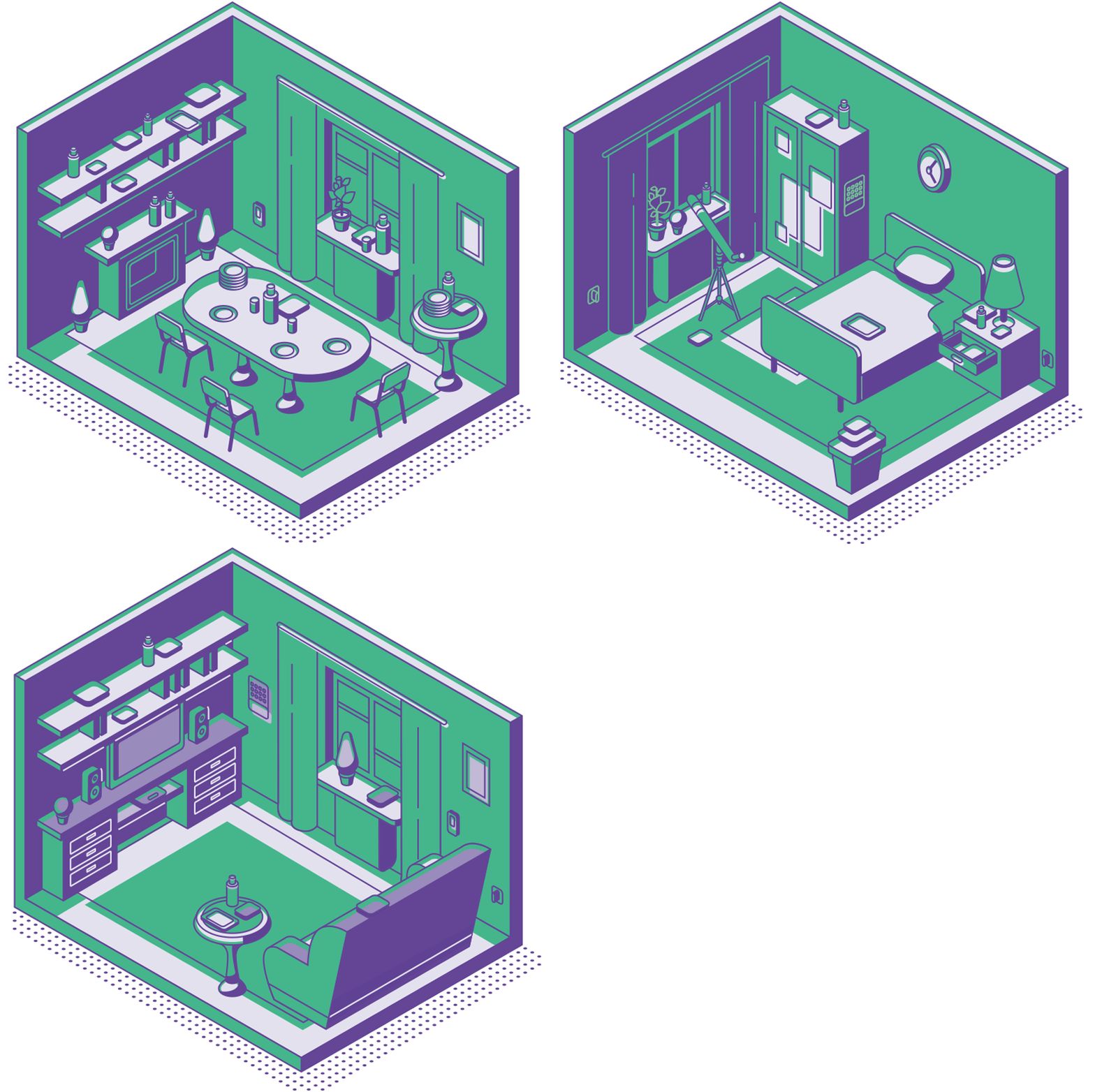
Architectural drawings and subtle iconography create an additional layer of texture, connecting the communication materials back to the studio's field.